-
When you click on links to various merchants on this site and make a purchase, this can result in this site earning a commission. Affiliate programs and affiliations include, but are not limited to, the eBay Partner Network.
-
Posts
4,254 -
Joined
-
Last visited
-
Days Won
5
Content Type
Profiles
Forums
NGC Journals
Gallery
Events
Store
Downloads
Posts posted by brg5658
-
-
Here are my latest. The gold I purchased a few months ago and I just loved the obverse design. The WWII commems I got as payment for evaluating a collection for a guy. I would have done it for free but I spent over two hours, I had fun and he learned a lot.

Great looking gold piece. That Caballito design is splendid, and I was glad to see they re-used it on other coins. (thumbs u
-
My NEWPs from Yarm's spring sale!
 Still one more to photograph once I can get it out of the air-tite.
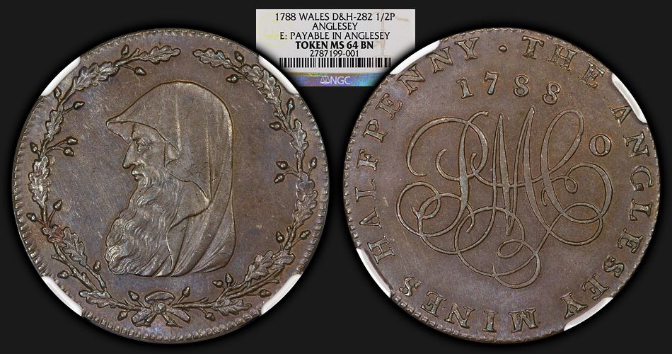
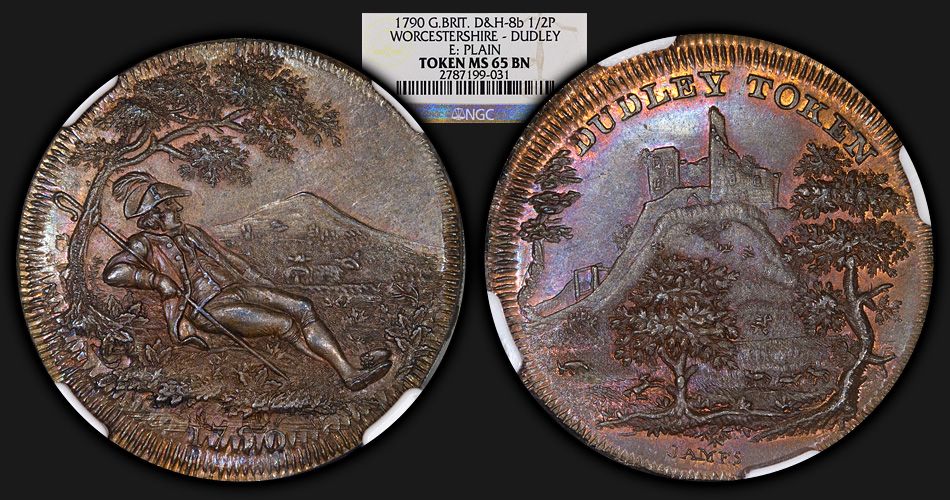
And, my 4th of this token -- which is also my avatar! I have a little "hoard" going.

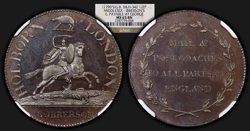
Thanks yarm! As always, top notch offerings! (thumbs u
-
I agree with Zo444 -- all of the coins posted by PolishSilver have a massive red-shift. Though, they still look to be lovely coins.
-
Gorgeous medal Yarm! Even if the "elder Vicky" isn't quite as beautiful as the young head portrayal.

-
I don't know if the Kempson token preceded the 1797 pennies and two pence or not, but the innovation of the broad rim with incuse lettering was definitely Boulton's and he used it before the 1797 coinage. As an example look at Lancashire 56 and 57 struck for Daniel Eccleston in 1794 with the same technique. I believe Boulton used it for a few other tokens as well. I'm sure Kempson saw some of these and copied the rims.
Thanks Conder101 for replying. I did remember seeing earlier examples of the method, but short of pulling out my D&H and thumbing through, I figured you or someone else would come along and know the answer.

-
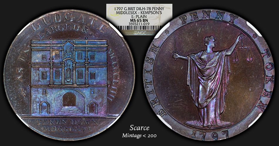
Very happy with this new token. Intense colors, prooflike glassy surfaces, cool reverse inset lettering surrounding Standing Justice. Just way too many attractive things to pass up.

Interesting to see it has the large rim of the regal penny made in the same year. Do you know if they came out before or after?
I'm not sure of the timing of these as compared to the cartwheel issues. But, these penny-size medalets are also not a SOHO/Boulton product. They were struck by Kempson in Birmingham (someone will correct me if I'm wrong there).
Good question, but I don't know the answer...if I do recall from my reading the inset surrounding letters were supposed to be an anti-counterfeiting measure on the cartwheel coins...
-
Very happy with this new token. Intense colors, prooflike glassy surfaces, cool reverse inset lettering surrounding Standing Justice. Just way too many attractive things to pass up.

-
Amazing! Now why can't our engravers do things like that today?
In their defense, they aren't working with a 76mm coin.
 But, I definitely hear ya!
 -
Bob, that medal is insanely beautiful! (thumbs u
-
Hi. What's a Conder? I have no idea what this post is about. thanks
Google is a wonderful thing...

-
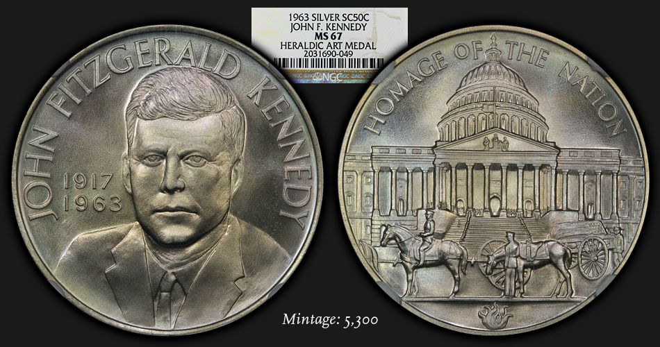
Thanks to BKW for pointing this medal out to me on a dealer's website. A lovely example of an "occasional" piece issued as part of the Heraldic Art Medals. In addition to the 60 main medals issued over the 20 years from 1959 through 1978, 7 special occasion pieces were also issued. The occasional pieces were issued in smaller mintages (max 5,300 medals) than the main 60 medals (mintages usually around 6,000 medals). This is the 3rd of the 7 special issues, designed and struck very shortly following the assassination of President John F. Kennedy in November 1963.
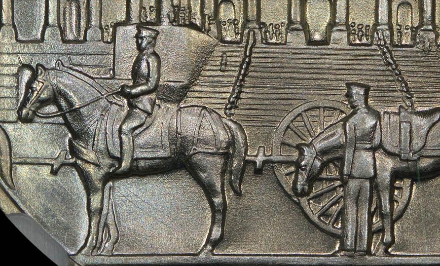
This medal has wonderful surfaces, with light champagne toning in the centers, and the lightest violet toning at the periphery of both the obverse and reverse. I also find the design quite beautiful in general, with semi-high relief that was common on many of the Heraldic Art Medal pieces.
I'm also posting a close-up of some of the lovely detail below.
-
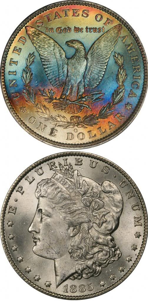
I don't like Morgans, but I wouldn't kick that one out of bed.

-
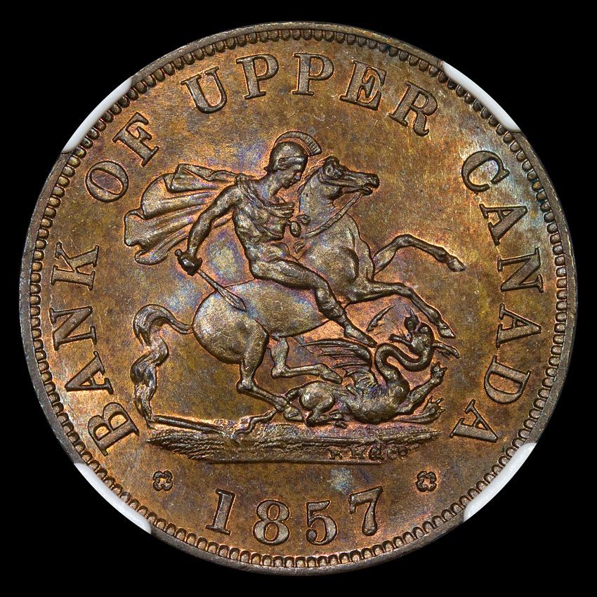
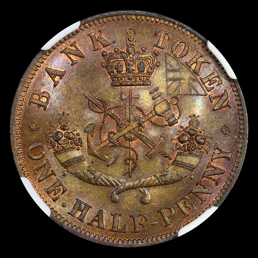
A very difficult token in this grade (NGC MS65BN):
-
-
-
-
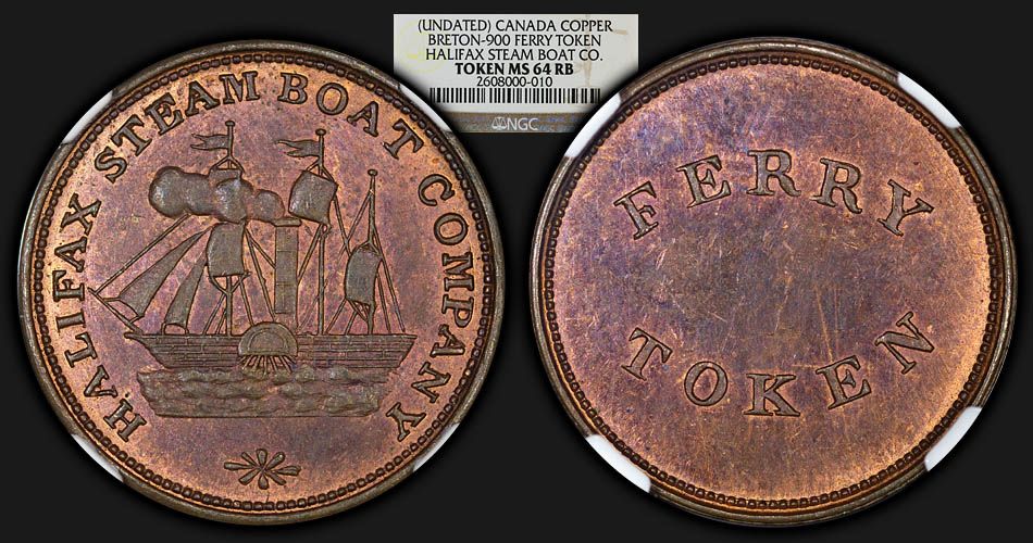
An interesting little Canadian token. As best I can tell, this "ferry token" was never actually used as such. The first mention of this token numismatically that I can hunt down was in The Canadian Antiquarian and Numismatic Journal in 1877. At one time it was thought to be quite scarce, but upon the discovery of a hoard sometime in the late 1890s, is now considered more available, with most pieces in AU or MS condition. I found the presentation of a "steamboat" with sails to be quite curious, but I am by no means a sea navigation expert.
Date of production circa 1850-1875.
-
I also sent a note to the moderators. Looks like they cleaned it up! (thumbs u
-
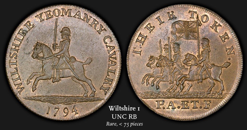
A new token from Bill McKivor's most recent list. This particular issue comes with more rough surfaces than would be seen on the higher quality SOHO products. This is a more difficult to find design, with a clear attraction for me as it has a grand total of 4 horses
 It was listed as UNC RB, with more red on the reverse than the obverse. It has a few non-distracting spots, and an overall strong strike with just a bit of weakness in the design at the middle and rear horsemen on the reverse. The reverse text "P.A. ET. F" stands for "pro aris et focis", translated (not literally) as "for God and country". Overall I'm very happy with this addition.
 -Brandon
-
Picked up a very nice toned Morgan from Jerseycat. Very happy with the purchase, and AJ is super easy to deal with. Two (thumbs u
-
-
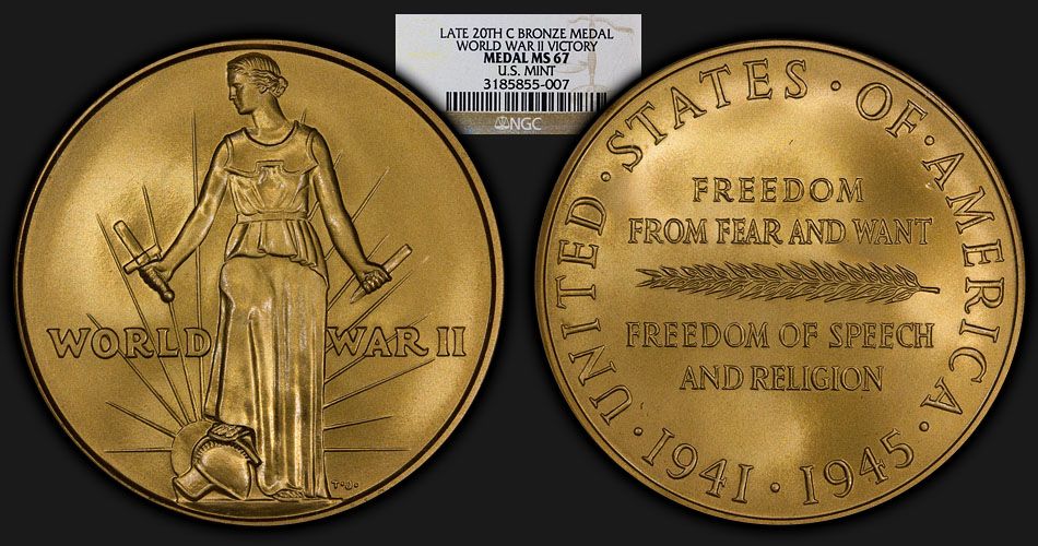
A new medal. I found the design to be quite lovely.
This medal is a restrike of the medal given to all members of the armed forces who served in World War II. It was designed by Mr. Thomas H. Jones, whose initials can be seen on the obverse at the right base of the female figure.
The female figure, Liberation, is shown facing left as though looking to the dawn of a new day, her right foot resting on a Roman war god’s helmet. In her right hand is a broken sword with the blade that was broken off in her left hand, symbolizing defeat of the Axis powers. Visible behind the war helmet is a rising sun with rays.
-
A recent pick up in an old NGC fatty holder:
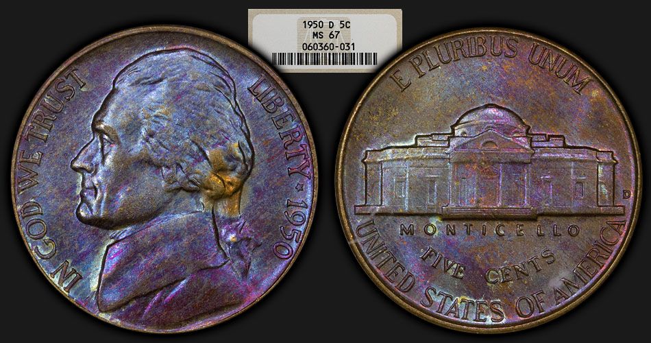
-
Here are a few NEWPs.
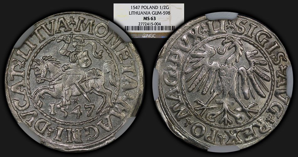
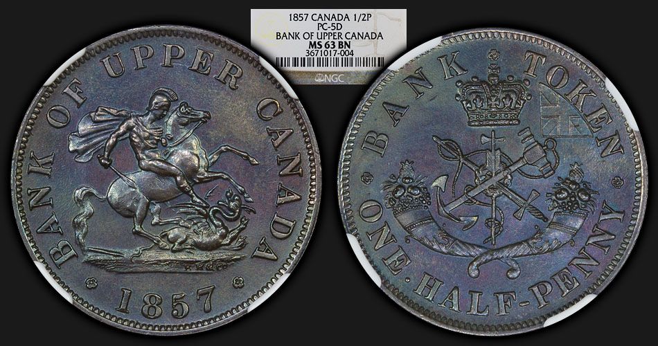
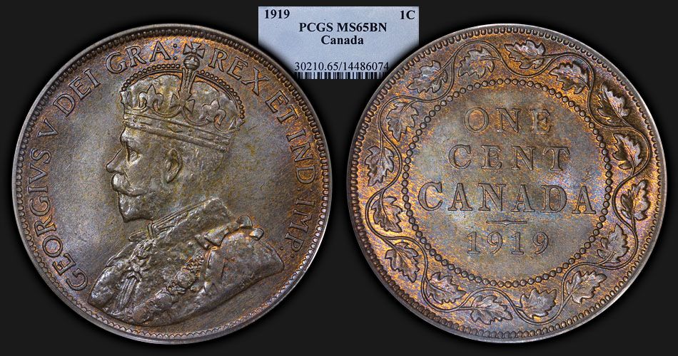




Post your most recent acquisition: US
in US, World, and Ancient Coins
Posted
Picked up a new War Nickel for my slowly-getting-there set.