-
When you click on links to various merchants on this site and make a purchase, this can result in this site earning a commission. Affiliate programs and affiliations include, but are not limited to, the eBay Partner Network.


James_OldeTowne
-
Posts
16,033 -
Joined
-
Last visited
-
Days Won
2
Content Type
Profiles
Forums
NGC Journals
Gallery
Events
Store
Downloads
Posts posted by James_OldeTowne
-
-
-
-
-
-
-
-
-
Personally, I believe the coin is fake. It may be a very good fake, but nonetheless, I don't believe such a genuine mule was ever produced from within the walls of the Federal mint.
-
I don't believe certification has even the slightest influence on the value of this coin. It's like an 1804 dollar in that respect. It's not like the grade is of any import, here
 .
. -

When I posted this coin on Monday, nobody happened to notice that this 1820 Capped Bust half is a little bit more "special" than a typical die-marriage for the date. (Admittedly, the image may be too small to attribute from.) It happens to be the whimsically-named "office boy reverse", so-called due to the plethora amateurish errors that can be seen on the reverse. This is not a rare die-marriage - in fact, relatively obtainable, but it is well studied because it reveals many of the problems encountered by the U.S. mint in the early years, when everything was done by hand.
I've owned a few of these over the years, but none this nice. I grade this coin EF-45+, virtually an AU coin with as much luster and attractive, original color as it has. Accompanying is a large scan of the reverse. I numbered a few areas of interest for discussion of some of my favorite points of interest regarding this fascinating die-marriage. Please feel free to contribute to the discussion!
1. The "D" from UNITED was originally punched much too far to the right. It was effaced and repunched in the correct location, but you can still see remnants of the original error.
2. T3 (the third T) sits too high in relation to the rest of the letters in STATES.
3. The O of OF was actually originally punched in correctly, but was then effaced and erroneously repunched too high! Notice how high it is relative to ES OF.
4. The F was originally punched correctly as well, but again, was effaced and erroneously repunched rotated a little counter-clockwise. You can still see a ghost image of the top right serif from the original punching
5. ME of AMERICA are blatantly joined, punched much too close together.
6. Overall, the letters in UNITED STATE OF AMERICA are poorly spaced, and there is particularly too much space between the C and A.
7. This particular example displays a nice die-crack from the olive branch to the denticles.
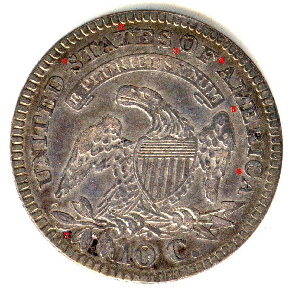
I cherry-picked this coin off a dealer who had it incorrectly attributed, which made it a pretty sweet deal. There are still really nice picks to be made out there, so keep looking!
-
James, it is absolutely gorgeous! It looks better in hand than in your photo. (This isn't intended to demean your photographic ability.) But, I think you have underestimated the depth of the mirrors. Maybe it was due to the slab. I'm tempted to crack it out because it doesn't deserve to be confined. If I do, I'll be sure to post some reflective pictures.
Chris, triple =>
 ! I am delighted to hear that you like it.
Since it is now your recent acquisition, I look forward to seeing your version of the coin imaged here now. I'm am glad the coin has found a new and caring home!
For those who don't know, Chris was kind enough to buy this coin from me, and I had commented about how I wasn't so sure it was DMPL by today's standards. However, I also thought it was undergraded by a point, leading me to believe that ANACS compromised on a grade of MS-63 DMPL.
The previous owner of the coin dated all his slabs, so we know for a fact that this one was slabbed sometime in early 1991 or before, and I for one believe ANACS was more conservative at that time than any service is today.
Chris, thanks again for the transaction!!
James
-
-
James what a smokin lot of coins. But I must say that the 1817/13 is SWEET!
Bruce, thanks and check out the new image!
James
-
James, I want this one...

Yeah, that one is pretty cheap, isn't it
 ?
?James
-
Some of these coins are from shows, but most are from buying and trading with fellow coin club members. My posts represent about a month's worth of effort, which is to say that there's nothing that fantastic here, but trying to find coins that I like takes time.
James
-
-
-
-
-
-
-
-
-


Post your most recent acquisition: US
in US, World, and Ancient Coins
Posted